
Are you treading water trying to navigate the sea of metrics flowing through your business ops and software tools? Stand fast. Business intelligence will save your life. Especially displayed on your very own ServiceTitan Essentials dashboard. Before we tell you how to use this analytical power tool, let’s explain why you should.
- It's a single source of truth: From retrieving historical data to blending multi-source data and merged reports, it produces accurate and reliable, real-time analytics. It's all you need to inform your decision-making.
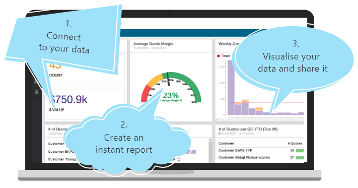
- It's an exercise in efficiency: It automates and speeds up your business reporting. With a shareable link, it communicates critical insights with teams in the field and across the company. Time saved is like money made.
- It's a very visual solution: Using graphs, charts and gauges (a.k.a. dashlets), it summarizes analytics in meaningful snapshots of your business. Click through to expanded spreadsheet-like reports for more detail.
Simplify your data tracking
Working with large volumes of metrics can quickly get old. Doing reports and calculations manually, uploading figures into Excel sheets the length of a loo roll, can make the eye twitch. You’re probably used to it taking forever, being painful. Talk about your business kryptonite!
Life is better when you can simply open a dashboard on your computer and see your business better. Especially when you’re confident that the data is constantly updated, current and accurate, on demand.
How you can be sure this is for you:
- Not too tech savvy? This solution was built for business owners, not data scientists.
- Got multiple ServiceTitans accounts on the go? Simply create account details to give your users access.
- Run your business with multiple tools? Connect data from 25+ software tools to Wink.
- Like having things your way? Customize the dashboard to reflect your unique needs.
No action without reliable insights!
Before deciding on the best course of action to reduce risk, you must identify activities that sap your resources. Before you can develop opportunities, you must see where they exist. The data holds real-world answers to questions about your business and revenue performance:
- Have you allocated sufficient time to achieve your targets? Start your assessment by tracking the length of a job/project from start to finish.
- Want to assess the profitability of particular field service jobs? Factor outstanding balances and percentages due for collection, filtered by job type into your analysis.
- How accurate were your sales projections for the financial year? Track revenue collected against the amount due, and merge aging balances into the calculation.
The only thing more useful than identifying trends and patterns in critical areas like debt collection, job detail, and invoiced sales in real time, is the ability to share essential info fast.
This dashboard has a shareable link, so your team can carry the insights with them wherever they go, and make data-driven decisions, consistently and on the fly.
Report the facts
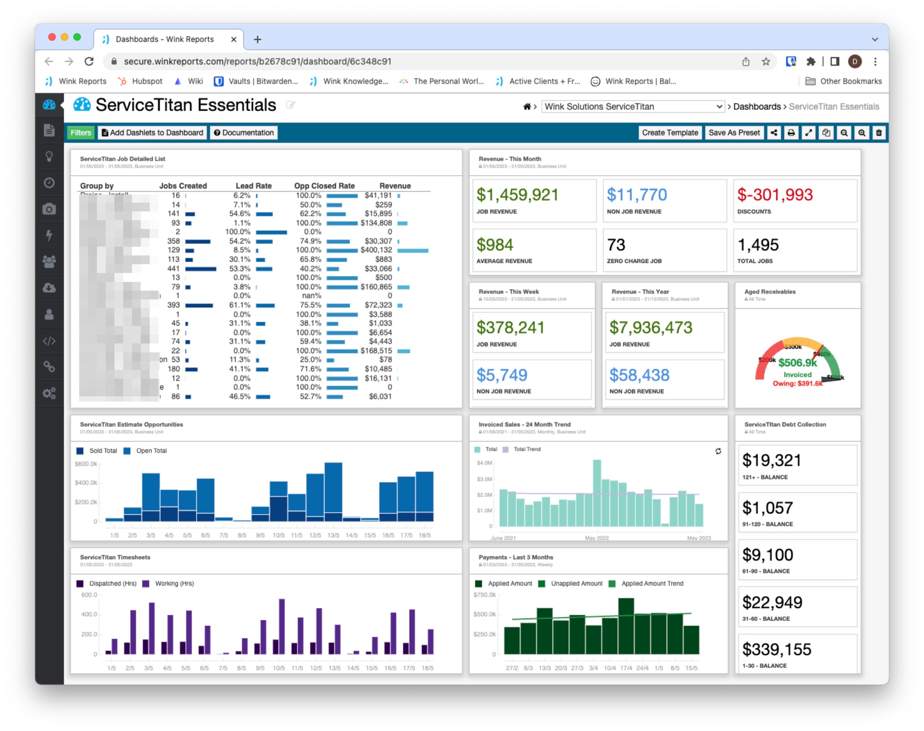
The dashboard draws on ServiceTitan jobs, estimates, invoices, payments and timesheet data sources. Dashlets summarize the essential business metrics, visualizing trends and patterns in revenue, key performance indicators, billing and balances.
You’ve got the flexibility to filter the reporting, for example, by status, business unit or campaign - lock it in to make life easier and save time for future analysis.
Use case: Trying to assess your teams’ actual revenue potential (but failing)?
Tracking staff performance, you’re confronted with a gamut of data sources to sift for clues: Are teams meeting targets? Are the targets achievable or do they need adjustment? It’s problematic when data sources aren’t integrated…
To assess their actual revenue potential, tap into your ServiceTitan estimates, invoices and payments data sources. You can customize the dashboard to display the particular insights you need, either from blending data from different sources or from merging relevant reports.
Your Payments metrics will indicate trends impacting revenue collection alongside invoiced sales; view the Estimates dashlet to see how you’re tracking over time on your estimated revenue totals and the value of lost opportunities on open sales.
Bringing up the rear, the Debt Collection report tracks aging debts where outstanding balances exceed a certain time period - 90 days, 120 days or older. Filter the report by business unit and the corresponding dashlet will display data analytics specific to that unit. Going into the report, you can assign a risk percentage and record the last customer engagement or the reason for non-collection.
You’ll gain comprehensive insights on revenue still due to specific business units - keep those project managers updated by sharing the info via the URL link.
Use case: Performance strategies work better when staff feel invested, but how to get their buy-in?
Nothing enhances the performance of your techs, project managers and business units like a little competitive spirit. Pull a Timesheets list to monitor the productivity of individual technicians - the corresponding dashlet visualizes activity hours over time and you can filter the analytics by job type to evaluate what resources you’re committing to which jobs. Techs can zoom in on their own job activity metrics to measure actual working time against dispatched time, and identify areas for improvement.
Run the Invoice Lines report to drill into the details of chargeable items on invoiced jobs against discounts offered and service fees charged. The corresponding dashlet displays results based on the applied filter, for example, sold by technician or business unit. Compare and identify the top performing teams and techs, and who’s lagging behind in job/order fulfillment. Let the latter learn from the former.
Spark some healthy competition by drawing on the Aged Receivables report: compare the performance of individual techs or business units by tracking invoices for balances due - the corresponding dashlet summarizes the percentage of monies collected.
In a visual, even fun way to track performance and encourage greater productivity, a dashboard gauge will show how close the tech/business unit is to achieving 100%. Simultaneously gather important data on slow-paying jobs and those that yield the highest revenue. Filter the analysis by business unit to display insights on specific teams.
You can then schedule automated reports for delivery, or directly share the dashboard’s URL link for techs to track their own progress. Staff will at least be motivated by bragging rights or increased incomes; at best, they’ll be keen to show off what they can do, and so maintain high performance levels.
There’s more…
Let’s say you want to evaluate efficiency levels in service delivery and the impact on revenue. Track your Invoice Lines, which break down classifications of job revenue and average job values. Then analyze the KPIs covering job completion, repeat visits and repair rates. Run a Timesheet report to highlight the impact on revenue of dispatched versus working time.
How about an accurate view of current opportunities in your workflow? Try tracking all new activity in the sales pipeline. You can pull a Job Detailed List to look at the total volume of new jobs with the corresponding dashlet summarizing quotes to indicate your projected sales, lead generation and closed rates.
Put this information in the context of seasonal trends to gauge how well you’re tracking with forecast sales: the Invoiced Sales dashlet displays all your invoice totals and seasonal trends over time.
Get your ServiceTitan Essentials dashboard now
We don’t know much about sailing but we do know that running a home service company without accurate analytics is a slow boat to nowhere. Accessing one source of truth from your multiple data sources will simplify your business reporting, enable you to share actionable insights, and get your staff into the habit of making the right decisions at the time.
Sound good to you? Then connect to Wink Reports and put the ServiceTitan Essentials dashboard to work for you. Start your 30-day free trial today.